I used to think green kitchen cabinets were risky, like wearing velvet to the grocery store. Then one late night scroll changed my mind. I saved seven kitchens in a row, phone on 2 percent, ramen boiling over, and the next morning my camera roll was basically a salad. Turns out green is not scary. It’s calm, earthy, and a tiny bit romantic, which is probably why I keep recommending it to clients and, yep, doing it in my own projects too.
Quick confession. When I collect designs on Instagram I always say I’ll save only three. Then I sneeze and it’s thirty. Once I accidentally sent a heart emoji to a cabinet maker I’ve never met, at 12:14 a.m., then hid under my blanket. But the saves from that night taught me a lot about shade, sheen, and balance. Let me show you exactly what works and how you can copy it at home without stress.
Heritage green with painted window trim and warm wood
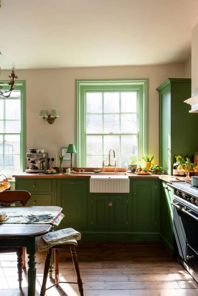
Photo 1 has that classic British-cottage vibe. The secret is painting the window frames the same green as the base units, so daylight bounces and the view gets framed like art. Warm wood counters soften everything and make the brass faucet glow. If your room is small, keep walls a creamy neutral.
- Micro hack: Line drawers with natural cork, it warms the tone and quiets the clatter.
Mushroom-gray green with glass uppers and button knobs
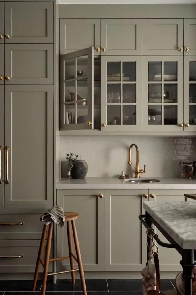
Photo 2 sits in a calm, refined zone. The green leans gray, which loves satin brass hardware and a pale quartz. Glass uppers keep weight off the wall, but only if you color edit what’s inside. Repeat the brass at the barstool footrest, tiny detail, huge impact. If you cook nightly, switch one glass door to reeded glass, saves your sanity on messy days.
Soft sage with herringbone backsplash and slim pulls
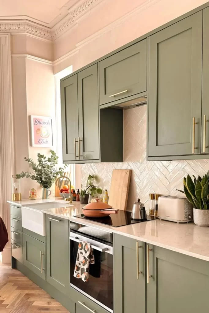
Photo 3 is the friendliest kitchen of the bunch. Sage reads gentle, then the herringbone tile brings movement so it never feels flat. Slim brushed pulls keep the lines clean and the brass warms the whole picture.
Tip I learned the hard way: Match grout to the lighter tone of the tile, not the cabinet. It keeps the wall from stealing the show.
Deep forest run of tall cabinets with a near-black island
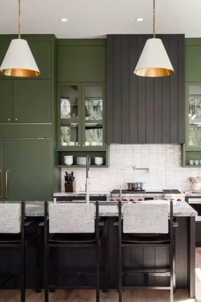
Photo 4 is bold and balanced. Tall green storage wraps the room, then the dark island acts like an anchor. I love the oversized white pendants with warm interiors, they bounce light onto the stone. If your ceiling is average height, keep crown molding simple and paint the range hood a shade deeper than the rest. That tiny shift adds depth without shouting.
Olive cabinetry with full-height marble backsplash and checks
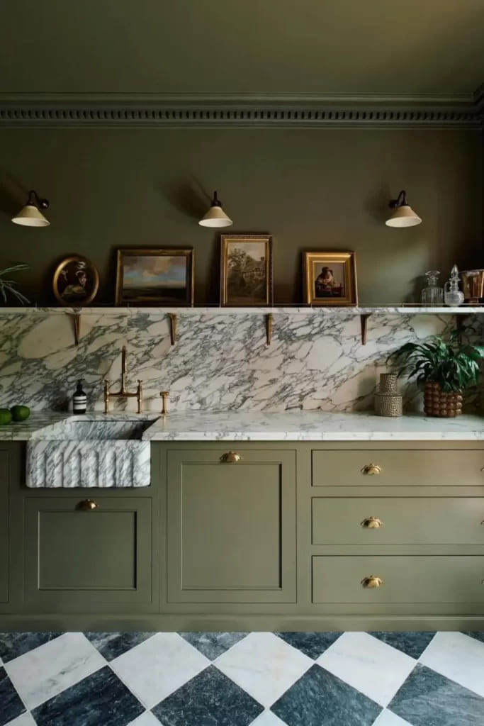
Photo 5 is dramatic in a quiet way. Olive is earthy, then the big marble slab sings. Checkerboard floors in soft gray and white feel classic, not theme-y. Go for a honed finish so fingerprints chill out. Cup pulls here are perfect because they underline the drawer lines.
Pro move: Run the slab into a small backsplash shelf and hide an LED strip under it for a glow at night.
Cottage sage with white counters and warm cone sconces
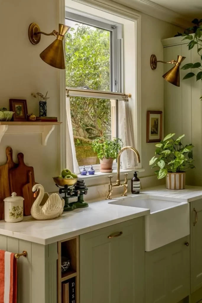
Photo 6 makes me want tea and rain. The pale green base units keep the room calm while white counters bounce daylight around. Brass cone sconces flank the window like jewelry. Add a small table lamp on the counter if outlets allow, it’s cozy light that costs almost nothing. For renters, switch only the hardware and sconces, then fake a panel look with thin trim on doors.
Inky green-teal perimeter with bright island top
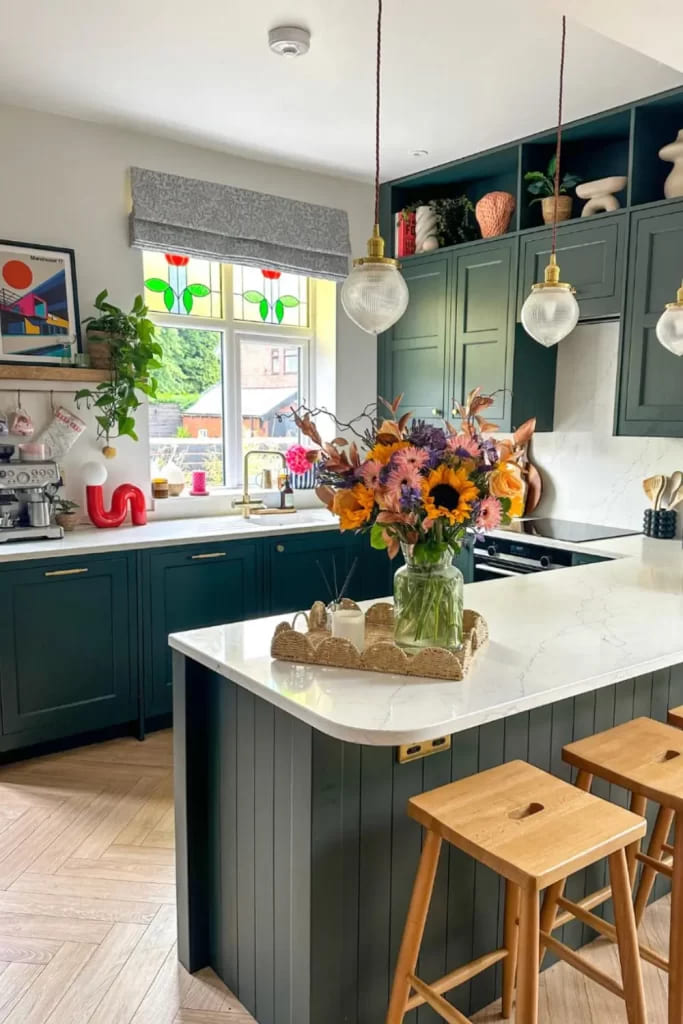
Photo 7 goes richer, almost teal, and it loves white-veined counters. Those globe pendants are friendly and a little retro, perfect scale over the island. Keep open shelves sparse, repeat wood tones in stools to connect with the floor. If you fear dark colors, start with just the island in the deep tone, live with it a week, then commit to the perimeter. Yes I do that trick with clients all the time.
Olive bases, beadboard wall, and a striped sink skirt
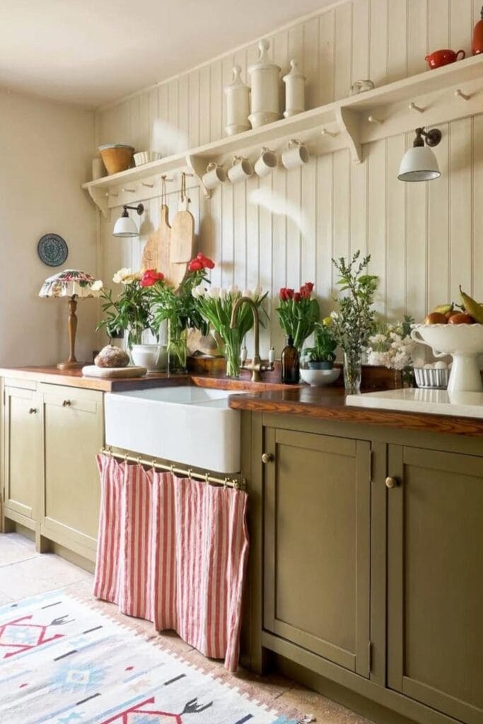
Photo 8 is pure farmhouse charm. Olive lowers plus a beadboard wall painted warm cream feels collected, not staged. The striped sink skirt hides bins and makes everyone smile, especially on laundry day when the trash isn’t cute. Wood counters here add welcome grain. Hang a simple rail under the shelf for mugs and shears, keeps the counter free and honestly looks adorable.
Mid-olive U-shape with globe pendants and a party island
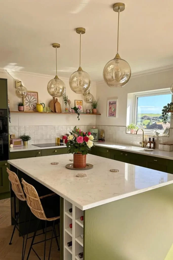
Photo 9 wants friends over. The mid-olive tone wraps the U, then a big island with a bright quartz top opens the center for chopping and chatting. Brass knobs keep it classic, no overthinking. If you have a view, keep upper walls clean and run a slim display shelf for art and plants.
Little hack: Put a wine cubby at the island end, it’s useful and fills awkward inches.
Forest green meets blush hex tile and white stone
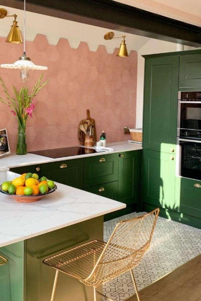
Photo 10 is the surprise pair that always works when undertones match. Blush hex tile sits softly behind forest green, then white counters clear the palette. Use aged brass on lights and hardware for warmth. If floors are patterned, choose a simple cabinet door profile so it doesn’t fight. I like a single long runner here in a muted pink or clay, it ties the story together.
How to pick your green without crying at the paint store
I keep this silly checklist in my phone. It works.
- Choose the family first: sage for airy, olive for earthy, forest for moody.
- Test three values on a single door. Same undertone, light to dark. Live with them morning to night.
- Put samples next to your floor and counter, not in isolation. Cabinets live between those two.
- Sheen matters. Matte or satin hides life better, semi gloss is for perfect carpentry and low traffic.
Hardware and metal mix, the fast way
Brass brings warmth, black adds graphic lines, nickel reads cool and classic. Pick one primary metal, then let appliances be the secondary. If you want a mix, keep each zone consistent to avoid chaos. Knobs on doors, cups on drawers is still the best simple plan. Promise. If pulls feel too long, go one size down, timid hardware makes nice kitchens feel shy.
Lighting for kitchens that don’t have a sunroom
Do three layers. Ambient cans on dimmers, task strips under the uppers, and pretty fixtures over the island or sink. Keep color temperature around 2700 to 3000K so greens stay rich. If your room feels flat at night, aim a tiny accent light at your backsplash, it paints texture without asking for attention. Also clean your bulbs. Dust makes light ugly. I forget too.
Real life care so the finish stays lovely
Grease happens. Wipe with warm water and a drop of dish soap, not harsh cleaners. Add felt dots behind trash pull outs to stop chips. Keep a labeled jar of touch-up paint in the pantry, future you will send a thank you text. If kids kick toes, run a tougher enamel on the toe kicks or use a wipeable matte clear coat.
Final take, from my messy Instagram saves to your home
After breaking down all ten, here’s my honest map. Choose sage when you want calm mornings and soft light on weekends. Choose olive when you love wood, linen, and a little vintage pottery. Choose forest when you cook late, play music, and want the counters to glow at night. Whatever path you pick, match undertones, respect sheen, and let one thing be the star, not five.