I was scrolling Instagram at midnight with cold tea and a sleepy dog, and a set of rooms jumped out so hard I sat up straight. These gallery wall decor ideas felt fresh and a little fearless, and they reminded me why I love walls that tell stories. I’ve styled a lot of homes, I’ve also hung frames too high and patched too many holes, so I’m giving you the pretty parts and the honest fixes.
gallery wall decor ideas
My easy plan goes like this. Pick a theme, lock a layout, repeat two details. Theme might be family, botanicals, or travel. Layout could be grid, staircase run, or a tight cluster. The two details I repeat are spacing and frame finish. Keep those steady and you can mix everything else like a confident chef.
Staircase storytelling that climbs with you
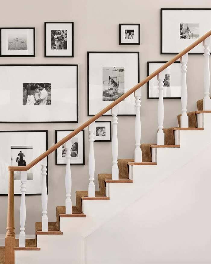
That stair shot is a master class. Black frames, thick white mats, soft neutral wall. Start by running a tape line that follows the angle of your railing. Align the centers of the frames to that line, not the bottom edges. It keeps the group rising in a friendly rhythm.
I leave about two inches between frames for a clean beat. Use lighter prints up high and bolder ones at hand level where you see them close. Felt bumpers behind every corner stop the dreaded tilt when feet stomp up and down.
Vintage birds and timepieces
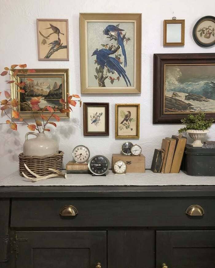
The little vignette with blue birds, stacked books, and old clocks feels cozy, almost like a tiny museum. Mix art with objects that share a mood. Here the mood is nature and time, so feathers, branches, and clocks all talk to each other.
When I style a console like this, I keep the tallest object one hand shorter than the bottom of the lowest frame. It keeps the group from crashing visually. Add a single branch with warm leaves to echo the gold frames. Simple, sweet, done.
Forest glow in a modern mix
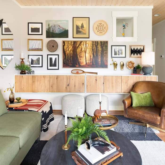
That living room with the glowing forest photo was saved to my phone in two seconds. Use one bold anchor, then surround it with art in different sizes and a couple round pieces. Round gives the eye a rest. Notice the frame finishes are cousins, not twins. Black, wood, and a touch of brass. That mix works because the mat colors are consistent.
I use white or pale cream mats for everything so the frames can party a bit without chaos.
Soft neutral salon that hugs the corner
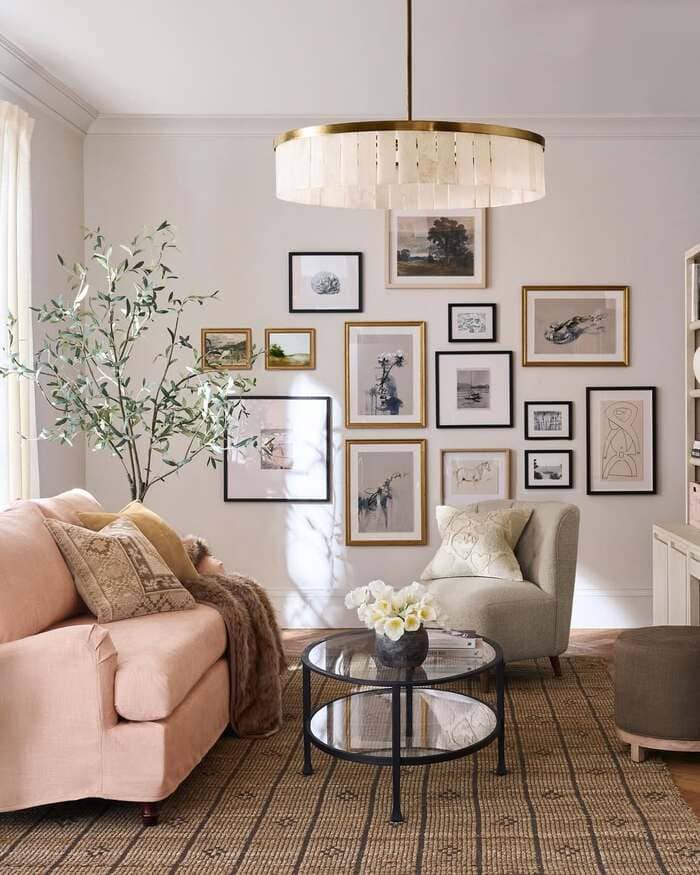
The pale pink sofa with a layered cluster to the side proves a gallery can be off center and still balanced. Start the group close to the corner and float outward. Keep the largest pieces near the middle, then sprinkle small ones where the gaps look thirsty. A chandelier with warm brass ties the frames together.
My little trick is to repeat the metal from the light in at least two frames. Feels intentional and grown up, even when the art is prints from Etsy.
Gentle botanicals with quiet gold
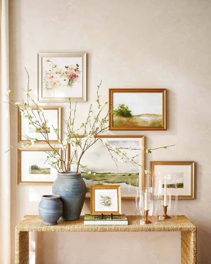
The grouping of florals and landscapes around a skinny console is the calmest moment. Use slim gold frames with soft art. Hang pieces so some edges overlap the visual shape of the console, not touching but close. That creates a pocket for your vase and candles.
When I work with delicate art like this, I switch to museum glass if budget allows. Reflection drops and the colors breathe. If not, choose matte prints and pull the curtains a bit to cut glare. Small moves, big peace.
Colorful mix with a picture light and a bench
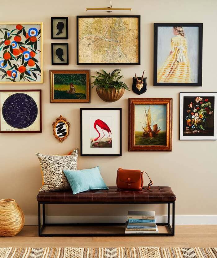
The wall with a map, silhouettes, a red flamingo, and a brass picture light makes me grin. It’s the perfect entry or hallway stop. Start with your bench height, then hang the lowest frame about eight inches above the bench so backs do not knock it. Add one plant in a wall pocket for life.
If you use a plug-in light, hide the cord with a slim cord cover painted to match the wall. I swear that little light makes everything feel special, like you meant it all along.
Nature study with quotes and nests
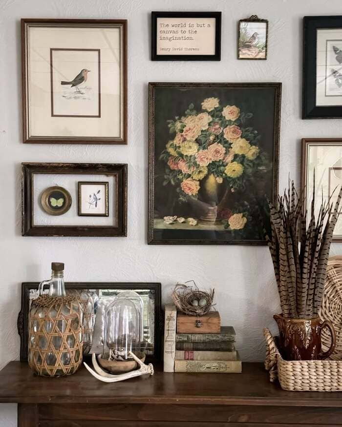
The vintage mix of birds, butterflies, and a tiny quote plaque is packed with charm. When you go heavy on small pieces, give them a simple rule. Same mat width across the set or same outer frame color. It lets your eye travel the wall without tripping. Layer the surface below with old books, a glass cloche, and something textured like wicker.
I keep one open book out. Guests always touch it and that means the room is working.
Small hallway grid that punches above weight
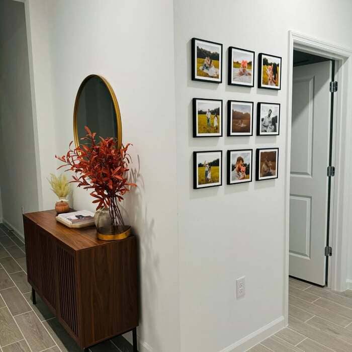
Nine square frames on a narrow wall equals instant order. Grids forgive awkward corners and they make renters happy.
I print photos with a thin white border, mount them in identical frames, and keep the gap around one inch. Use a level once, then take a photo of the first row so you can match the second. Hang the grid close to a mirror or a round vase to soften the edges. It looks intentional, not corporate.
Ferns and sketches with bright mats
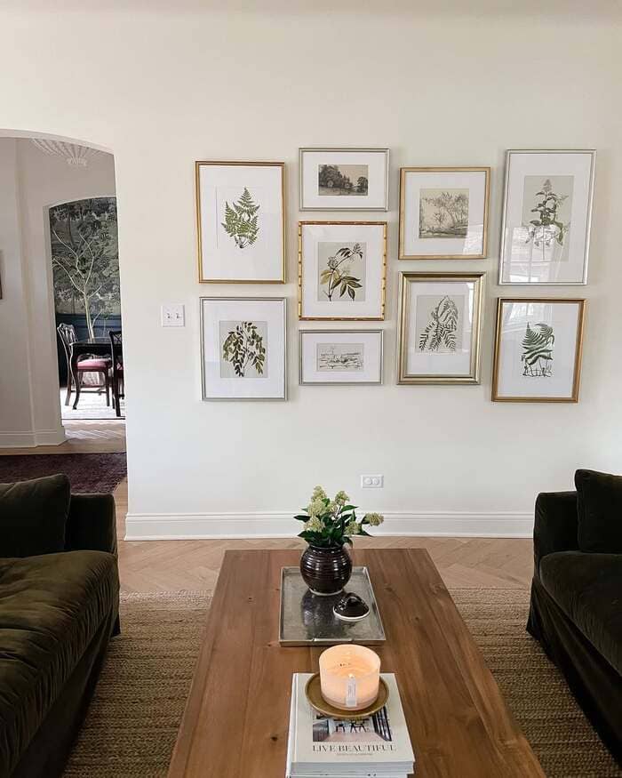
The botanical set with gold and silver frames is a great lesson in mixing metals. Put one dominant metal on the outer frames and let the inner ones be slightly different. The art shares a subject, which keeps it calm.
I like to tilt a tiny frame in the middle by a hair. Not crooked, just alive. If that makes you itch, keep everything square and add a textured rug nearby for warmth.
Maximal cottage layers
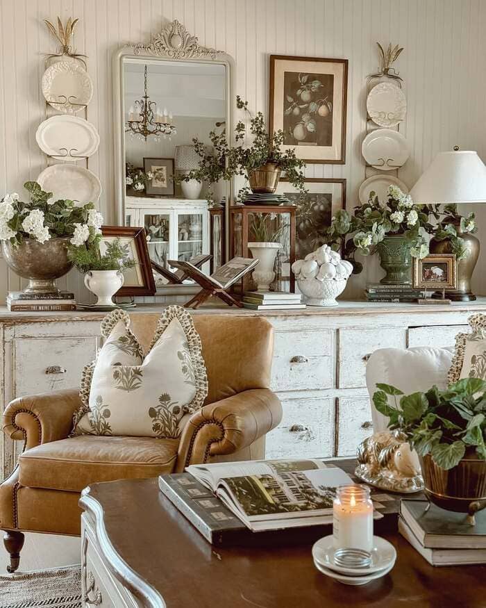
The room stacked with plates, a big mirror, and art leaning everywhere proves a gallery can be deep, not only flat. Stand a heavy mirror on a buffet and layer frames around it. Hang plate racks like columns on both sides and your wall turns into a happy shrine. To keep it from feeling stuffed, repeat green plants in three spots.
Your brain reads the green as commas. Yes, commas. The room breathes.
Color-happy wall that sparks a grin
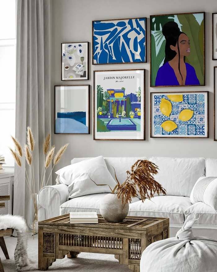
That blue and lemon wall above the white sofa is pure sunshine. If you love bold art, keep frames simple. I use slim wood frames with white mats so the color can sing without yelling. Start with the largest piece a hand above sofa height, then build outward like a puzzle.
Tip from my toolbox, lay all pieces on the floor first and snap a photo, then copy it on the wall. Saves arguments, trust me.
The timeless six-square grid
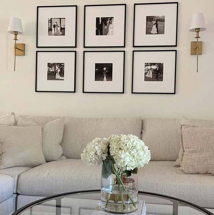
The black and white wedding grid teaches a calm lesson. Grids are soothing because your brain stops guessing. Make a paper template of one frame, trace it six times on kraft paper, tape them up, and adjust till the gaps match. Two inches between frames for small rooms, three for larger. Use thick mats so tiny photos feel important.
I also stick felt bumpers on each corner so kids jumping on the sofa don’t tilt anything. I learned that the hard way.
Big anchor with friendly sidekicks
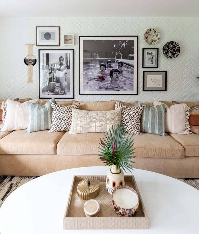
I adore the room with the giant pool photo and the tall portrait next to it. Start with one oversized anchor slightly off center. Then add medium and small pieces that echo its colors or shapes. Mix orientations so it feels collected, not forced. Toss in one round or woven item for a breather. Your eye needs a rest stop. The coffee table tray repeating a color from the art ties the whole zone together.
Maximalist joy, but still tidy
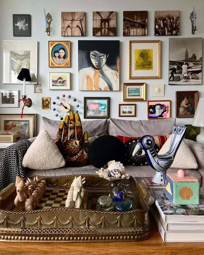
The wall full of frames, objects, and personality is basically my happy chaos. When you go big, keep a shared baseline. I run a blue painter’s tape line about eight inches above the sofa back and align the bottoms of the lowest frames to that line. Everything else can float above.
Add one quirky piece, a sconce or a tiny carved hand, to break the rectangle. Museum putty on frame corners is your best friend for anti-tilt.
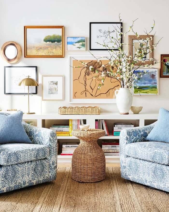
Natural textures and odd objects
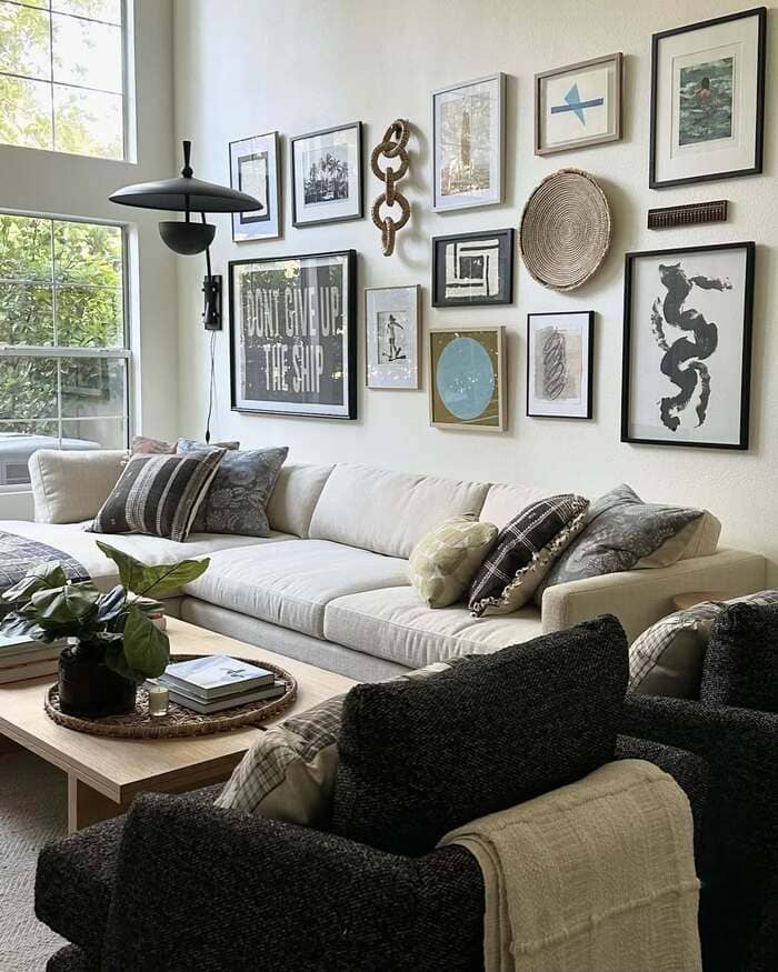
The neutral lounge with rope chain, basket tray, and soft art shows how texture can carry a story. If your prints are quiet, let mats and frames do the talking. Linen mats, wood frames, a woven tray, and one sculptural thing. That rope chain is weird in the best way and it makes people lean in.
For tall walls, run the collection high and keep the spacing wider. Air around art makes a room feel richer even when the pieces are affordable.
Bright, breezy mix over shelves
The airy wall with branches in a big vase is a styling cheat code. Use your bookcase as a stage. Pull three colors from the art and repeat them on the shelf in stacks of books and small objects.
Keep one shelf mostly empty so the eye can rest. Patterned chairs in front want one big simple piece in the mix so the wall doesn’t get jittery. You don’t need twelve stars. One moon is enough.
Giant family photo grid
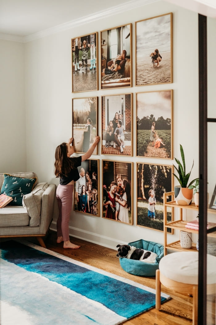
The nine huge family photos make kids feel like main characters. Print on matte paper to reduce glare. Keep frames identical and gaps even. I hang the bottom row at a child’s eye level and the top row for adults.
Everyone gets connection. If your photos come from different seasons, run them through the same warm filter so tones match. Quick hack, a subtle sepia wash makes unrelated shots feel like a set.
Playful eclectic with mirror and flamingos
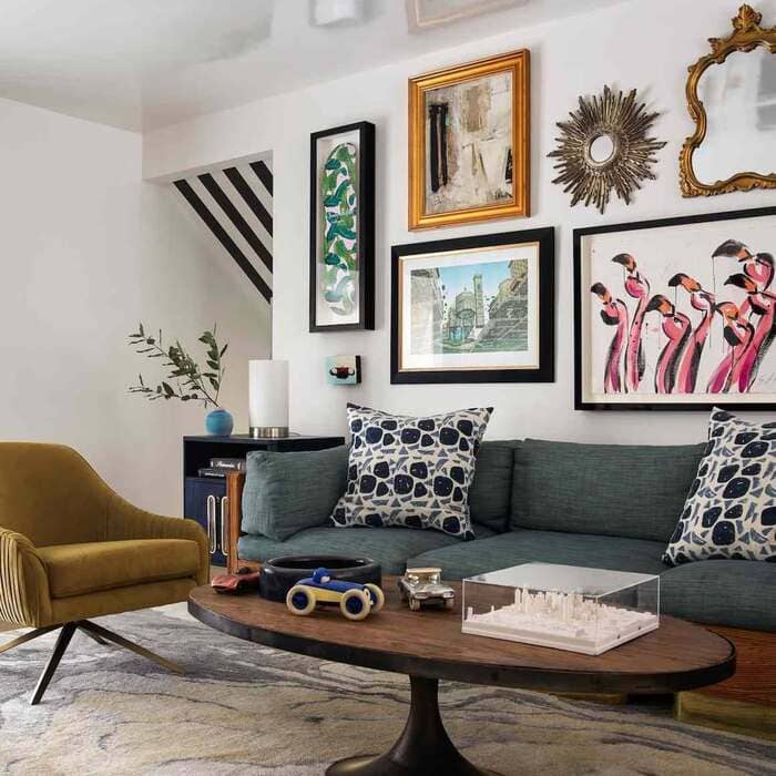
The teal sofa scene with a sunburst mirror, flamingo print, and abstracts shows a simple recipe. One vintage piece, one graphic piece, one mirror. Repeat mat color across everything to bridge frame finishes.
I love mirrors in a gallery because they bounce light and make a tight room breathe. Place the mirror off center so it reflects something pretty, a plant or a window, not a ceiling vent. Ask me why I mention ceiling vents.
Small classics in the dining room
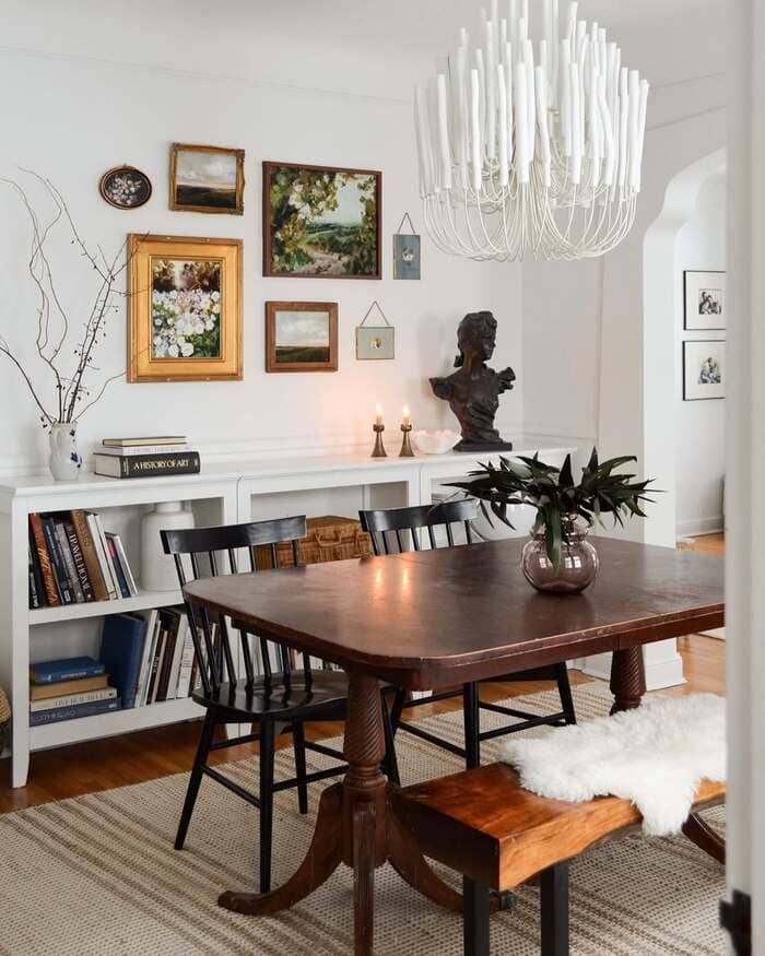
The dining room with little landscapes and florals proves small art can carry a wall. Group tight so they read as one. Use odd counts five or seven pieces. Lower the cluster slightly because you view art here while seated.
Candles on the buffet echo the warm frames and make dinner feel special even if it’s chicken nuggets night. Also yes, rug tape, or you’ll be chasing corners forever.
Travel wall that tells a route
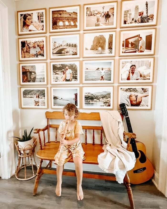
That grid of travel photos above the wooden bench owns the hallway. Use one frame style and a narrow gap around one inch. Crop all photos to the same ratio and keep horizons straight so it doesn’t wobble.
Hang the bottom row eight inches above the bench back. Slip a throw and a guitar nearby and suddenly the wall has a soundtrack. It’s funny how props make memories feel bigger.
My no-stress hanging kit
In my bin I keep painter’s tape, kraft paper, a pencil, level, stud finder, tiny screws, heavy anchors, command strips, felt dots, museum putty, and extra wire.
I also keep a sharpie to mark the back of frames with their layout number.
When I take a wall down to clean, it goes up fast later. And here is my cheap hack I learned while collecting those Instagram saves last week.
Use blue tape to create the outline of each frame on the wall first.
Move the tape around until the spacing feels like music. Then hammer once, not nine times.
Little rules I break on purpose
I hang art a bit lower than museum height if the sofa is deep.
I let one frame touch the edge of a doorway, very lightly, because it makes the home feel lived in. I mix kid drawings with fine prints. Joy wins over fancy. I will also use printable art when the budget is tired.
You print now, swap later.
No guilt.
Final thoughts you can use today
Start with one anchor piece you love. Repeat two quiet details, maybe black frames and two inch gaps. Pick a layout that suits the wall you have, not the one in a catalog. Staircases love diagonal rhythm, hallways love grids, corners love tight clusters. Add one odd object, like a basket or a plaque with a quote, to keep it human. And if you pound an extra hole, you are in good company. Patch, touch up, keep going. Your wall is a story, and these ideas are just your starting lines.